YUGU - Business Card (2025)
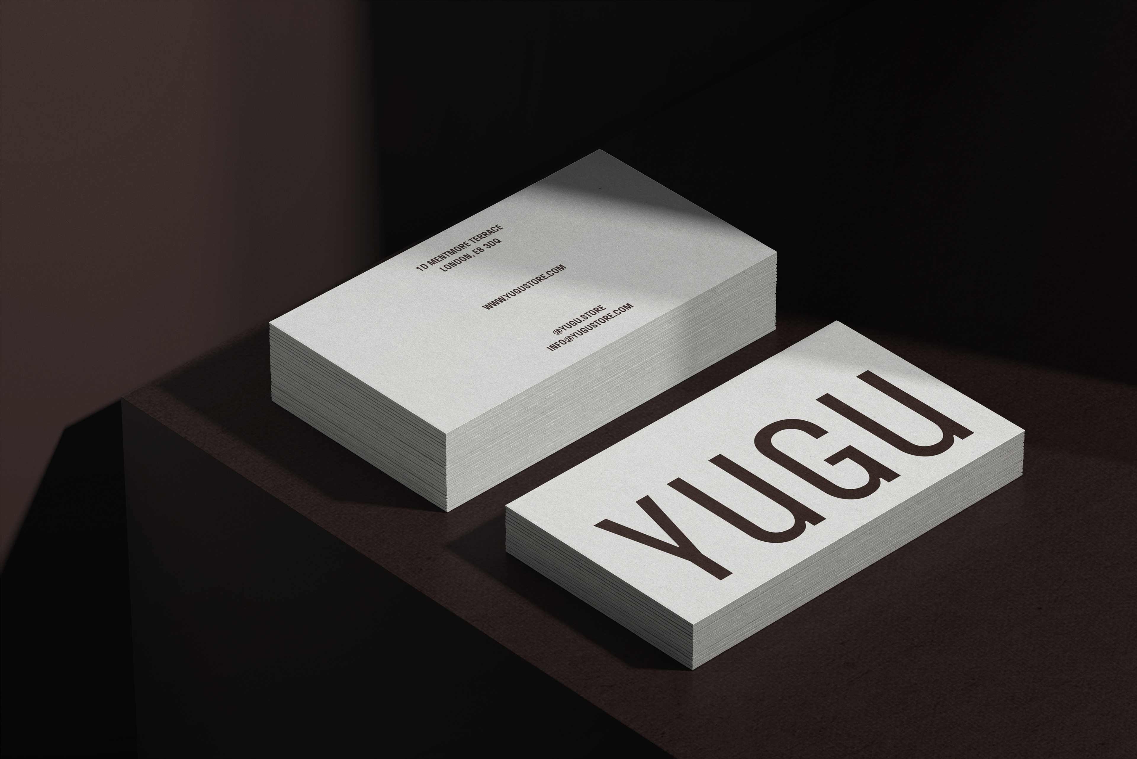
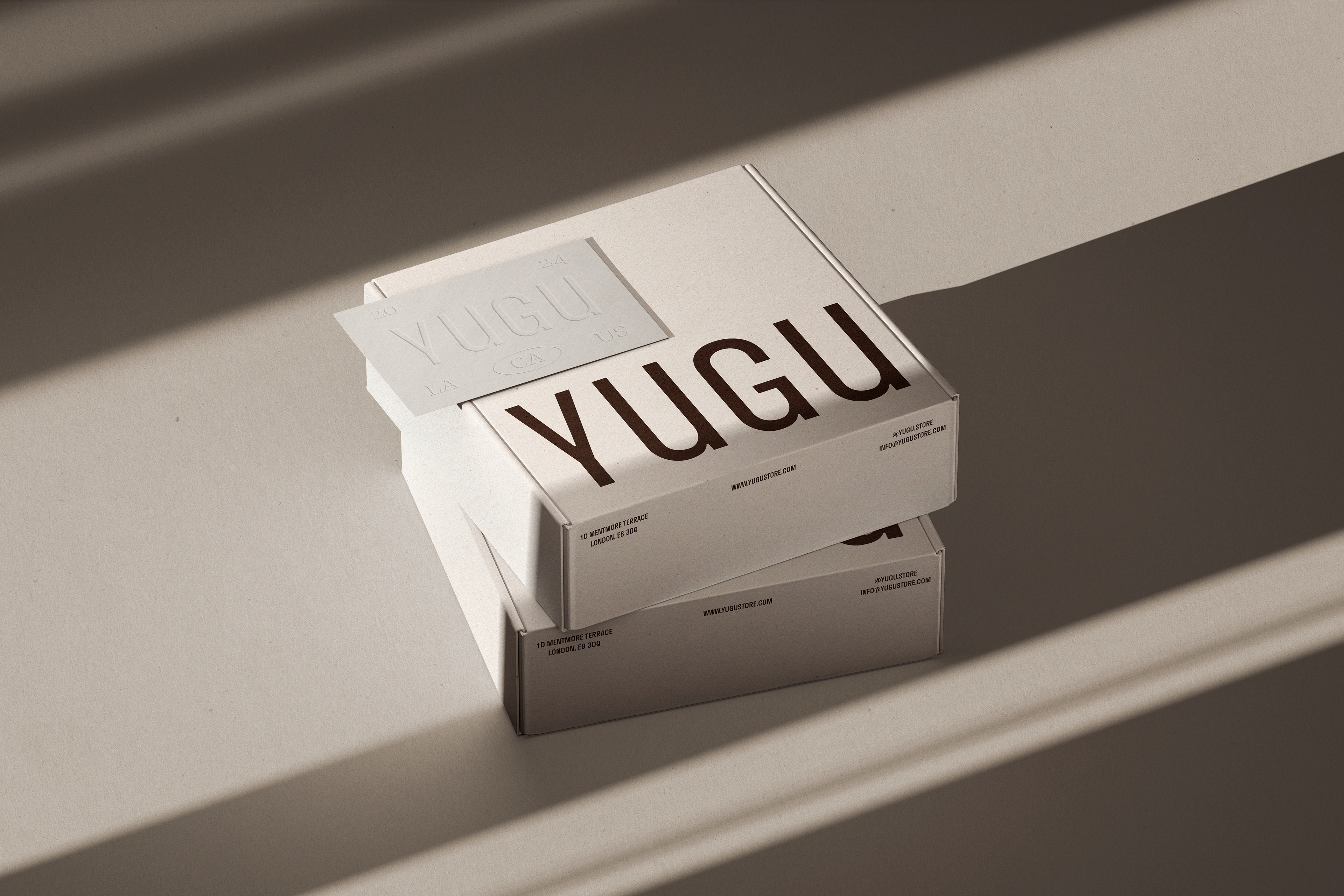
영국 런던의 편집샵 YUGU의 명함 디자인 작업이다.
'YUGU'는 대표가 애정하는 한국의 특정 지역명에서 유래한 이름으로, 브랜드의 정체성과 친근함을 동시에 담아내고자 했다. 명함은 극도로 절제된 미니멀리즘을 기반으로 하되, 따뜻한 접근성을 잃지 않도록 디자인했다.
화이트 베이스에 브라운 톤의 타이포그래피를 적용해 차분하면서도 세련된 인상을 전달하며, 앞면에는 'YUGU' 로고타입을 과감하게 배치해 브랜드 네임의 존재감을 강조했다. 뒷면에는 연락처와 웹사이트 정보를 깔끔하게 정렬하여 가독성과 정보 전달력을 확보했다.
엠보싱 기법을 활용해 'YUGU' 로고에 촉각적 경험을 더했으며, 이는 명함을 손에 쥐는 순간 브랜드의 섬세함과 품질을 직접 느낄 수 있도록 한다. 전체적으로 고급스러우면서도 접근 가능한 편집샵의 이미지를 시각적·물리적으로 구현했다.
This is the business card design for YUGU, a select shop in London, UK.
'YUGU' is a name derived from a specific Korean region the founder cherishes, aiming to embody both the brand's identity and approachability. The business card design is based on extreme minimalism while retaining a warm accessibility.
A white base paired with brown-toned typography creates a calm yet refined impression. The front features a bold placement of the 'YUGU' logotype, emphasizing the brand name's presence. The back presents contact information and website details in a clean alignment, ensuring readability and effective information delivery.
Embossing technique is applied to the 'YUGU' logo, adding a tactile experience that allows recipients to physically sense the brand's attention to detail and quality the moment they hold the card. Overall, the design visually and physically realizes the image of a sophisticated yet approachable select shop.